BOTANICALS ON WHITE

botanical : of or relating to plants

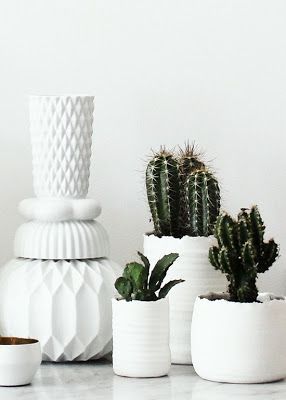
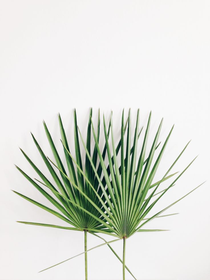
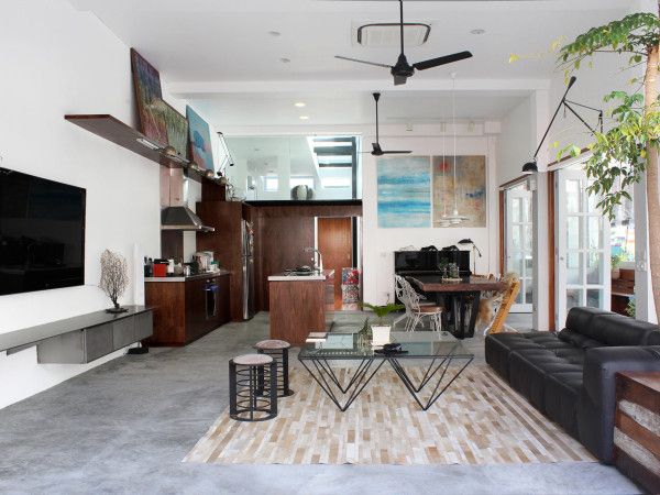
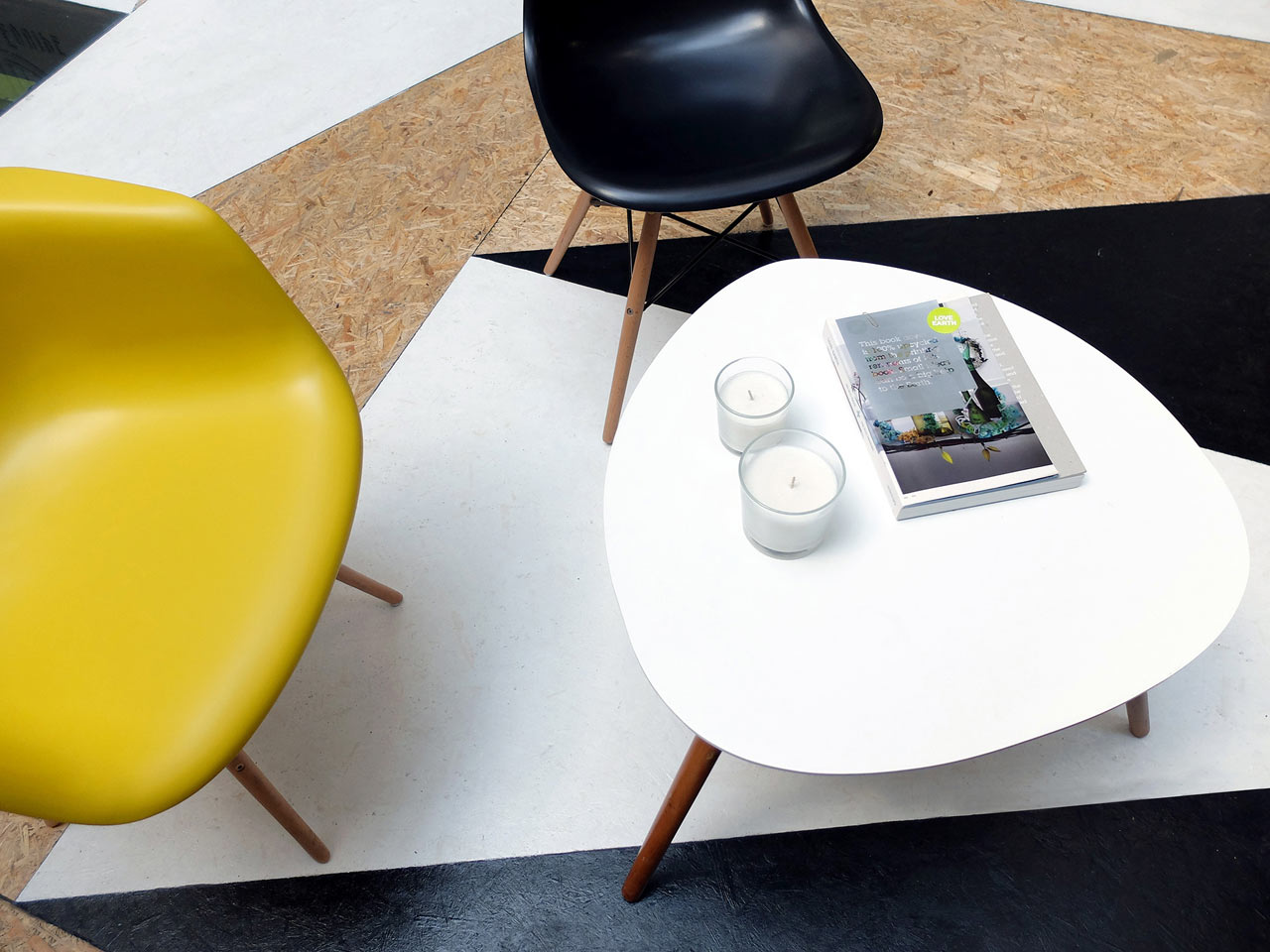
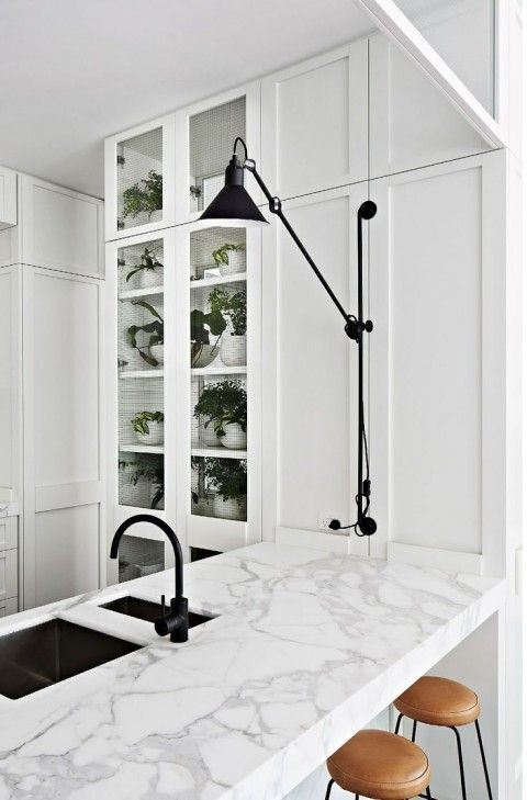
Don't be afraid of white walls. Too often, we assume that we need to paint over plain white walls or add a pattern through wall coverings. White walls are a perfect clean slate for adding greens. Green and white create crisp lines, outstanding contrast, and yet a warmth and familiarity. Fresh plants, including succulents, palms, money trees, cacti, and more, all stand out on a white canvas of a wall or container. Uber popular right now are white ceramic or porcelain containers, in geometric shapes (see links below). Our favorite palms for an indoor space: ruffled fan palm (for large corrugated leaves), banana palm (very tropical with large, single leaves), slender lady palm (who can't love that name), cat palm (lots of small stalks with feathery leaves). 

These plants aide in filtering indoor air, while filling out otherwise blank spaces. Succulents and palms are relatively easy to keep alive, although we even have a couple that are not doing too hot (sorry, very sorry). Do research before you buy; here is one of our favorite resources.

Looking for containers? These ceramic hanging ones by lightandladder come in different sizes and are easily mountable with a wood dowel. lightandladder also sells these wonderful, organic ceramic containers, with hexagonal wooden seats. redravenstudios sells these amazing porcelain envelopes, which can add dynamic shape and pattern to a botanical installation. Father Rabbit sources these conal ceramic planters by Gala Collier, easily mounted with a single nail. Keep exploring- these are just our favorites.

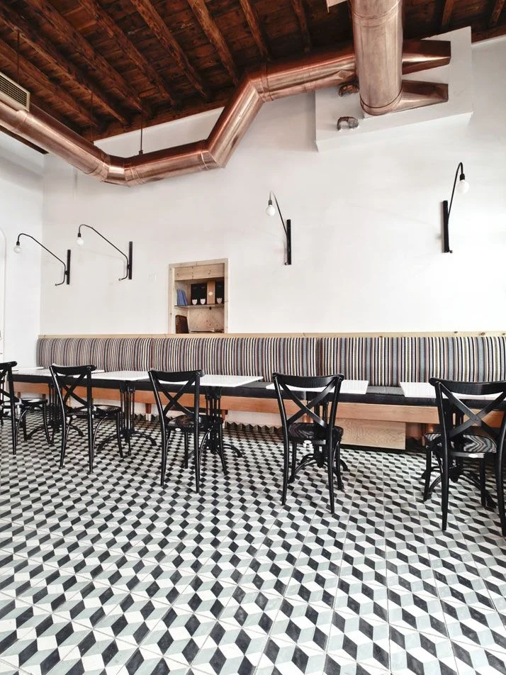
Don't be afraid of fruit: lemons and limes are organic and crisp against a white canvas, but kumquats are the cutest in size and bitterest in taste. How about having these scattered between cafe tables where guests can pick their own fruit?

TRANSITIONAL FLOORS

As we all know, finishes and materials have the opportunity to make a critical impact on a space and surroundings. They provide a tactile and palpable experience on all planes, and the details involved can enrich or hinder the material. We have seen transition strips used in commercial and healthcare spaces, producing awkward ends and beginnings of materials. Below, we have explored celebration of the transition, instead of hiding it. It's all in the details, my friends.

Transitions between materials can produce organic, patterned lines where two materials meet. A wooden floor is custom cut to accommodate hexagonal tile, forging a new, sensual median line in the space. The change from wood to ceramic tile also denotes a change of program: for example, an entry way, kitchen, dining or bath to a lounge or dry area. 

The subject in the space participates in the change as well: the sound of high heels tinkering along the ceramic until they hit warm wood, an echo of pots and pans in the kitchen versus the muted conversation in a living area, the neatness of bathroom tile changes to a cozy nest of a bedroom hardwood. This experiential transition also translates to color and texture, such as a lime green to bright white in a bathroom area, or a warm, light wood to a cooler wood in the kitchen. This change in color helps users consider the spaces intuitively: the start to a more private bath area, or a "stay-out-of-the-way" kitchen area.

Another transitional trick is light. Light is a medium that should be fully integrated into the designs from the beginning. Light can either mask or highlight a transition. Below, we see a back lit stair which shifts the main tile into a stepped wood bathtub area. The light not only provides a cautionary warning to the users of the step up, but also blurs the line between two hard materials.

Transitions are evolving, from organic patterns to light and color to experiential participation.

BLACK FIXTURES

Black is an iconic, timeless, classic color. The little Black dress. Black is the new Black. Black tie. It appears endlessly in fashion and is somehow always being reinvented. However, when designing space, black is something to be used sparingly. It is used as an accent or focal point instead of an entirety. This is because, among other things, overwhelming use of black in space makes space seem small, uninviting, and dark. Black has been something to be avoided in many eras and fields of interior design.

We are now seeing black resurfacing in interior design. One of the ways black is appearing in design now is in fixtures and hardware. It can stand out in a bright space and ground another. With hardware and fixtures tending to come in just a handful of finishes and colors, this emergence of black is welcomed. Also in commercial spaces it is important for a designer to take product maintenance into account. Bathroom fixtures, accessories, and hardware are items that thousands of users may touch throughout the designs lifetime. A black finish is a great low maintenance option where less cleaning and upkeep will be required and the fixture will appear new and fresh for a long time.

MODERN TROMP L'OEIL

Tromp L'Oeil, or to deceive the eye, is an art technique that originated in the Baroque period, utilizing perspective sketching and drawing to create realistic paintings and artwork. Deception of depth and materials, especially seen in set design, builds new and unexpected spaces with just a paintbrush.

We're now seeing modern, unique wallcoverings with tromp l'oeil patterns, creating either realistic perspectives or miniature dioramas. Mostly monochromatic, tromp l'oeil wallcoverings provide an unnatural feeling of space and horizon with bookshelves turned on their sides and white props stacked on imaginary shelves. Found in cafes, lounges, and waiting areas, these graphic walls invoke interest through traditional artistic methods. Floors have also taken on a tromp l'oeil effect, mostly through tiling techniques. We see geometry creating faux three-dimensional planes through shadow and highlight tiles. See below for our favorites.

RECREATE: use with a neutral backdrop, to avoid too much visual stimulation. Click on images for original source.

GRAYSCALE GEOMETRIC TILE

As designers with an eye for detail, we tend to look to the ground for inspiration. Floor details give an insight to the design and precision of the space. A recent trend in floor detailing is geometric tiles, usually in ceramic or concrete form. Grayscale tile is perfect for a clean backdrop to allow other pops of color or material in the space, whether it be a cafe, private bathroom, spa or entryway. The geometric shapes, however, add another layer of detail to the otherwise flat surface. 

In a cafe in Paris, geometry is an overwhelming theme, with a triangular wood bar top and hexagonal floor tiles. The hexagons are glossy black, offsetting the warm wood. Grayscale geometric tile is in. Shapes and patterns we have seen include hexagons, parallelograms, abstracted florals, herringbone, tweed, and more. These patterned shapes carry the eye through the space, without overwhelming in color. See below for specifics.

RECREATE: in any room, big or small, geometric tile can be that subtle impact, without overpowering the senses.